The Problem with Buttons
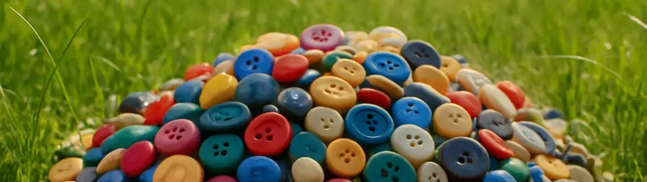
Creating buttons seems like a simple task, but it can be a bit tricky to get right.
Lot of States
Even a “simple” button has to respond to a bunch of states:
- default
- hover
- active
- focus
- disabled
Then your app adds its own flavor:
- selected
- primary
- secondary
- loading
- danger
- success
- outline
- icon
- icon-only
- waitingForServerToStopFlaking…
And multiply those accross device types like desktop, tablet, and phone and there is a small explosion of possible states and variants.
Let’s Build One Anyway
Just gonna vibe code a basic React button and walk through where it works—and where it breaks down.

Check out the live demo to see these buttons in action!
Button.tsx
import { useState, useEffect } from "react";
import type { LucideIcon } from "lucide-react";

interface ButtonProps {
  icon: LucideIcon;
  text: string;
  selected?: boolean;
  onClick?: () => void;
}

const Button = ({
  icon: Icon,
  text,
  selected = false,
  onClick,
}: ButtonProps) => {
  const [isHovered, setIsHovered] = useState(false);
  const [isPressed, setIsPressed] = useState(false);

  useEffect(() => {
    if (!selected) {
      setIsHovered(false);
      setIsPressed(false);
    }
  }, [selected]);

  const handleMouseEnter = () => {
    setIsHovered(true);
  };

  const handleMouseLeave = () => {
    setIsHovered(false);
    setIsPressed(false);
  };

  const handleMouseDown = () => {
    setIsPressed(true);
  };

  const handleMouseUp = () => {
    setIsPressed(false);
  };

  const handleTouchStart = () => {
    setIsPressed(true);
    setIsHovered(true);
  };

  const handleTouchEnd = () => {
    setIsPressed(false);
    setTimeout(() => setIsHovered(false), 150);

    if (onClick) onClick();
  };

  const handleTouchCancel = () => {
    setIsPressed(false);
    setIsHovered(false);
  };

  const handleClick = () => {
    if (window.matchMedia("(hover: hover)").matches) {
      if (onClick) onClick();
    }
  };

  const getButtonStyles = () => {
    if (selected) {
      return {
        background: "dodgerblue",
        border: "1px solid dodgerblue",
        color: "white",
      };
    }
    if (isPressed) {
      return {
        background: "black",
        border: "1px solid black",
        color: "white",
      };
    }
    if (isHovered) {
      return {
        background: "black",
        border: "1px solid black",
        color: "white",
      };
    }
    return {
      background: "transparent",
      border: "1px solid black",
      color: "black",
    };
  };

  const buttonStyles = getButtonStyles();

  const getAnimationClass = () => {
    if (selected) return "selected";
    if (isPressed) return "pressed";
    if (isHovered) return "hovered";
    return "";
  };

  return (
    <button
      className={`nice-button ${getAnimationClass()}`}
      style={{
        backgroundColor: buttonStyles.background,
        borderColor: buttonStyles.border,
        color: buttonStyles.color,
        display: "flex",
        alignItems: "center",
        gap: "8px",
        padding: "10px 16px",
        borderRadius: "12px",
        cursor: "pointer",
        transition: "all 0.2s ease",
      }}
      onMouseEnter={handleMouseEnter}
      onMouseLeave={handleMouseLeave}
      onMouseDown={handleMouseDown}
      onMouseUp={handleMouseUp}
      onTouchStart={handleTouchStart}
      onTouchEnd={handleTouchEnd}
      onTouchCancel={handleTouchCancel}
      onClick={handleClick}
    >
      <span className="icon-wrapper">
        <Icon size={20} color={buttonStyles.color} />
      </span>
      <span className="text-wrapper">{text}</span>
    </button>
  );
};

export default Button;
Button.css
/* Button */
.nice-button {
  position: relative;
  overflow: hidden;
  transition: background-color 0.3s, border-color 0.3s, color 0.3s;
  width: 100%;
  justify-content: flex-start;
  font-weight: 500;
  box-shadow: 0 2px 5px rgba(0, 0, 0, 0.1);
}

/* icon */
.icon-wrapper {
  margin-right: 4px;
}

/* text */
.text-wrapper {
  font-size: 1rem;
}

/* Wiggle animation for hover */
.nice-button.hovered .icon-wrapper,
.nice-button.hovered .text-wrapper {
  animation: wiggle 0.5s ease;
}

/* Press in animation */
.nice-button.pressed .icon-wrapper,
.nice-button.pressed .text-wrapper {
  transform: scale(0.95);
  transition: transform 0.1s ease-in;
}

/* Selected state animations */
.nice-button.selected .icon-wrapper,
.nice-button.selected .text-wrapper {
  animation: pop 0.3s ease;
}

/* Ensure smooth transitions for icon and text */
.icon-wrapper,
.text-wrapper {
  transition: transform 0.2s ease, color 0.2s ease;
  display: inline-flex;
  align-items: center;
}

/* Add hover effect */
.nice-button:hover {
  transform: translateY(-2px);
  box-shadow: 0 4px 8px rgba(0, 0, 0, 0.15);
}

/* Add active effect */
.nice-button:active {
  transform: translateY(1px);
  box-shadow: 0 1px 3px rgba(0, 0, 0, 0.1);
}

/* Enhanced mobile touch styles */
@media (hover: none) and (pointer: coarse) {
  .nice-button {
    -webkit-tap-highlight-color: transparent;
  }

  .nice-button.pressed {
    transform: scale(0.97);
    box-shadow: 0 1px 3px rgba(0, 0, 0, 0.1);
    transition: transform 0.1s ease-in, box-shadow 0.1s ease-in;
  }

  .nice-button.pressed .icon-wrapper,
  .nice-button.pressed .text-wrapper {
    transform: scale(0.95);
    transition: transform 0.1s ease-in;
  }
}

/* Wiggle animation keyframes */
@keyframes wiggle {
  0% {
    transform: rotate(0deg);
  }
  25% {
    transform: rotate(-5deg);
  }
  50% {
    transform: rotate(0deg);
  }
  75% {
    transform: rotate(5deg);
  }
  100% {
    transform: rotate(0deg);
  }
}

/* Pop animation for color change */
@keyframes pop {
  0% {
    transform: scale(1);
  }
  50% {
    transform: scale(1.1);
  }
  100% {
    transform: scale(1);
  }
}

/* Smooth transition styles for button states */
@keyframes smooth-color-change {
  from {
    opacity: 0.8;
  }
  to {
    opacity: 1;
  }
}

/* Mobile */
@media screen and (max-width: 540px) {
  .nice-button:hover {
    transform: none;
  }

  .nice-button:active {
    transform: none;
  }
}
Strengths
Touch Support: Handles both mouse and touch well.
Good UX Feedback: Animations for hover, press, and selection add nice tactile feel.
Component Isolation: Doesn’t rely on global context—fully self-contained.
Honestly, it’s a nice button. It feels good to click. You want to click it.
Weaknesses
Too Much Internal State: Hover, press, and selection are tracked in React state when the browser could handle most of this with :hover and :active.
Inline Styles: Makes it hard to theme or override styles externally.
State Explosion: Adding more states like loading, disabled, or danger requires touching the component logic.
Doesn’t the DOM do that?: We’re recreating what the browser already does well.
Accessibility: No aria-*, no keyboard handling, nothing to help screen readers.
It works, but it’s already harder to extend than it should be.
Better Button Ideas
Option 1: CSS-Heavy
Let the browser and CSS do what they’re good at. One root class like .nice-button, then variants like .primary, .secondary, etc. Use CSS variables to theme, use :hover, :active, and :focus for state.
No internal state. No inline styles. Just clean, scalable CSS.
✅ Great for design systems.
✅ Easy to theme.
❌ Harder to dynamically change content (like icons or labels on loading).
Option 2: JSX-Heavy
Leaning all the way into React. You define your states in JSX:
<Button>
  <ButtonState type="default">Save</ButtonState>
  <ButtonState type="hover">🖱 Hovering</ButtonState>
  <ButtonState type="loading">⏳ Saving...</ButtonState>
</Button>
React handles rendering the right content based on internal state. You get full control.
✅ Great for animation, dynamic content, marketing-style buttons.
❌ Boilerplate-heavy, hard to scale across a team.
Option 3: Hybrid
Use class-based styling for layout, color, and animation but let the component handle special states like loading, selected, etc. Maybe it swaps icons. Maybe it disables clicks. But most of the work happens in CSS.
✅ Composable, themeable, extendable.
✅ Easy to maintain.
❌ Still needs some discipline to avoid getting bloated.
Conclusion
Turns out making an awesome button isn’t that simple, but doesn’t have to be complicated either.
Over the next few posts, I’ll break down different the different approaches above and see what works well and what doesn’t.